One movement. Many vehicles.
Hello Seven is the master brand. Every program, the podcast, the events, the certification — they all inherit its type, voice, and photography, then carry one signature accent of their own. Pick a brand to open its profile.
Design
guide—
lines.
A movement, not a coaching brand.
Hello Seven exists to teach women, BIPOC, and LGBTQIA entrepreneurs how to build seven-figure businesses and create generational wealth. Everything you make under this brand has to sell that conviction — premium enough to justify the price point, human enough to feel genuinely inclusive, loud enough that you remember it.
Three pillars
Every decision — color, copy, layout — should ladder up to at least one of these. If it doesn't, it's not Hello Seven.
Visually loud.
Big type, full-bleed photography, structural marquees. We don't whisper. The work should land at full volume, then breathe.
Verbally direct.
Confident-mentor energy. Wise older sister, not life coach. Short declarative sentences. No hedging. No bro-bravado. No corporate cliché.
Unapologetically premium.
Editorial-fashion register: wide tracking, generous whitespace, candid photography. We sit next to Vogue, not next to a webinar.
Audience
Specific people. Not "everyone."
- Women entrepreneurs scaling toward — or already past — seven figures, who are tired of being talked down to.
- BIPOC and LGBTQIA founders historically locked out of traditional wealth-building rooms.
- Coaches, consultants, and operators who lead service businesses and want to systematize them.
- Partners — venues, sponsors, collaborators — putting their name next to ours and needing the brand to read first-class.
Sub-brands
All of these live inside the Hello Seven house. Each has a specific lockup and colorway; the master system rules below still apply.
- Hello Seven — the parent brand. Red-and-black identity.
- Hello Seven Mastermind — flagship coaching program. Multi-colorway lockups (Red / Blush / Black / White / Gold).
- Hello Seven Coach — certification sub-brand. Uses the Silver accent for credentialed/Pro moments.
- Hello Seven Podcast — Instagram-story forward. Rose & cream palette.
- ROI — annual event. Session templates and speaker cards.
The wordmark does the work.
Our identity is a wordmark and a badge — that's it. The "7" geometry (parallelogram cut) is the structural signature; protect it. Don't redraw, don't outline, don't stretch, don't gradient.
Primary marks
The red wordmark on white is our default. The black wordmark and badge cover everything else.


Downloadable lockups
Every colorway — download each as a 1500px PNG or vector SVG.
Clear space
Reserve space equal to the height of the "7" cap on all four sides. Nothing — type, photography, edges — crosses this boundary.
Minimum sizing
Smaller than this and the wordmark loses its weight. Use the badge in any spot below 24px.
Min 0.75 in
Wordmark width on physical print collateral.
Min 110 px
Wordmark width on screen — web, app, deck.
Min 24 px
Use the badge for favicons, app icons, anything below wordmark min.
Misuse
The wordmark stays as drawn. Always.
Never alter proportions. Resize uniformly, always.
The wordmark sits flat on the baseline. No tilts, no arcs.
Red on red, blush on cream — never. The wordmark must hold its own against the background.
Sub-brand lockups
For Mastermind, Coach, Podcast, and event marks, use the supplied lockups. Don't compose new lockups by typesetting "Hello Seven [Thing]" yourself.


A three‑way conversation.
Black for authority. H7 Red for action and emphasis. Blush for breathing room. Every other color is a supporting role. Each hue runs a five-step tint scale (20/40/60/80/100%) — invent nothing outside this palette.
Core palette
If a design uses only these four, it's already on-brand.
Red scale
H7 Red at 100. Wine and Deep Red are reserved for shadowed photo blocks and print overprints — not body UI.
Blush scale
Blush 100 is the dominant reading-section background. The paler steps slot in as alternating section backgrounds for editorial rhythm.
Neutrals
Black + grey scale for type and hairlines. Charcoal is for body copy where pure black is too heavy.
Premium accents
Reserved metals. Gold belongs to Mastermind; Silver to certification, partner, and "Pro" tier moments. Both are applied as gradients — never flat fills.
Pairings & contrast
Stick to these tested combinations. Pure white on H7 Red — never cream/blush on red — is a defining brand detail.
Color do/don't
Do
- Default to black on white or black on blush for long-form reading.
- Use H7 Red for one job per layout: the CTA, the marquee, or the emphasis word — pick one.
- Layer blush → white → blush across sections to create premium-editorial rhythm.
- Reserve Gold for Mastermind and premium-tier moments only; always as a gradient.
Don't
- Don't black-on-everything — full-page black reads cheap, not premium.
- Don't invent new hues. The 5-step scales are the system.
- Don't use psychedelic or blue-purple gradients. Off-brand on contact.
- Don't use red as a body-text color. Red is for emphasis at display sizes only.
Two faces. No exceptions.
Tenor Sans for display, Montserrat for body. There is no third font. Headlines run enormous and tracked wide; body copy stays direct and medium-weight. If you need to add hierarchy, do it with size and color — not with a new typeface.
Display · Tenor Sans
Wide, geometric, thin-weight. Always uppercase. Tracking +20 (0.02em). Reads cinematic, editorial, fashion-house.
Bb&
Body · Montserrat
Medium 500 for copy, Regular 400 for long reads, 600/700 for emphasis. Italic for pull-quotes only.
Bb&
a b c d e f g h i j k l m n o p q r s t u v w x y z
0 1 2 3 4 5 6 7 8 9 . , ; : ! ? @ # & * — →
Type scale
Use a token name from this scale instead of typing a raw px value. Display sizes are fluid (clamp) on web — minimum to maximum across viewport.
Type do/don't
Do
- Push display sizes bigger than feels comfortable. Hero type can run 160–256px on 1920 layouts.
- Treat tracking and case as part of the type, not a setting. ALL CAPS Tenor Sans always carries +0.02em.
- Pair a giant Tenor headline with generous whitespace below it. Let it land.
- Use Montserrat 500 as the default body weight — Regular 400 only for long reads.
Don't
- Don't introduce a third typeface. No script fonts, no serifs, no "fun" display swaps.
- Don't set Tenor Sans in sentence case or below 24px — it falls apart.
- Don't track body Montserrat. Tracking lives on display type and eyebrows only.
- Don't letter-space CAPS by eyeballing. Use the eyebrow scale (0.2em) and stop.
Direct. Punchy. Built on conviction.
We don't hedge. We don't ask permission. We don't soften our edges. Confident-mentor energy — the wise older sister who has built the thing and is telling you exactly how to build it too. Warm, never precious. Funny, never jokey.
You can be a millionaire.— Hello Seven signature line
Voice rules
If a line could appear in a generic coaching email, rewrite it.
We sound like
- Direct, second-person: "You can be a millionaire."
- Movement-claim plural: "We should all be millionaires."
- Short declarative sentences punctuated by longer editorial passages.
- Rhetorical openers that name a real frustration: "Are you tired of building a business that owns you?"
- Confident-mentor tone — telling you, not asking you.
We don't sound like
- Hedging — no "maybe," "kind of," "if you're interested."
- Startup-bro: no "crush it," "ninja," "hustle."
- Corporate-coach cliché: no "unlock your potential," "level up," "holistic journey."
- Stacked exclamation marks. The typography is loud enough.
- Emoji. Never. They break the premium register.
Casing
Casing is part of the brand, not a stylistic choice. The wrong case immediately reads off.
- Headlines & wordmarks —
ALL CAPSin Tenor Sans, tracked +0.02em. - Eyebrows & tags —
ALL CAPS, Montserrat SemiBold, tracked ≥0.2em, small (10–12px). - CTAs —
ALL CAPS, Montserrat SemiBold, 14px. - Subheadings — title case, Montserrat 500–600.
- Body copy — sentence case, Montserrat 400–500.
- Pronouns — primarily second-person "you." First-person plural "we" for movement copy. "I" only for Rachel's POV.
Signature patterns
These four shapes show up across every surface. Use them as scaffolding when you're stuck.
Are you tired of building a business that owns you?
You can be a millionaire.
Million-dollar requests.
We should all be millionaires.
Candid over posed. Joy over aspiration.
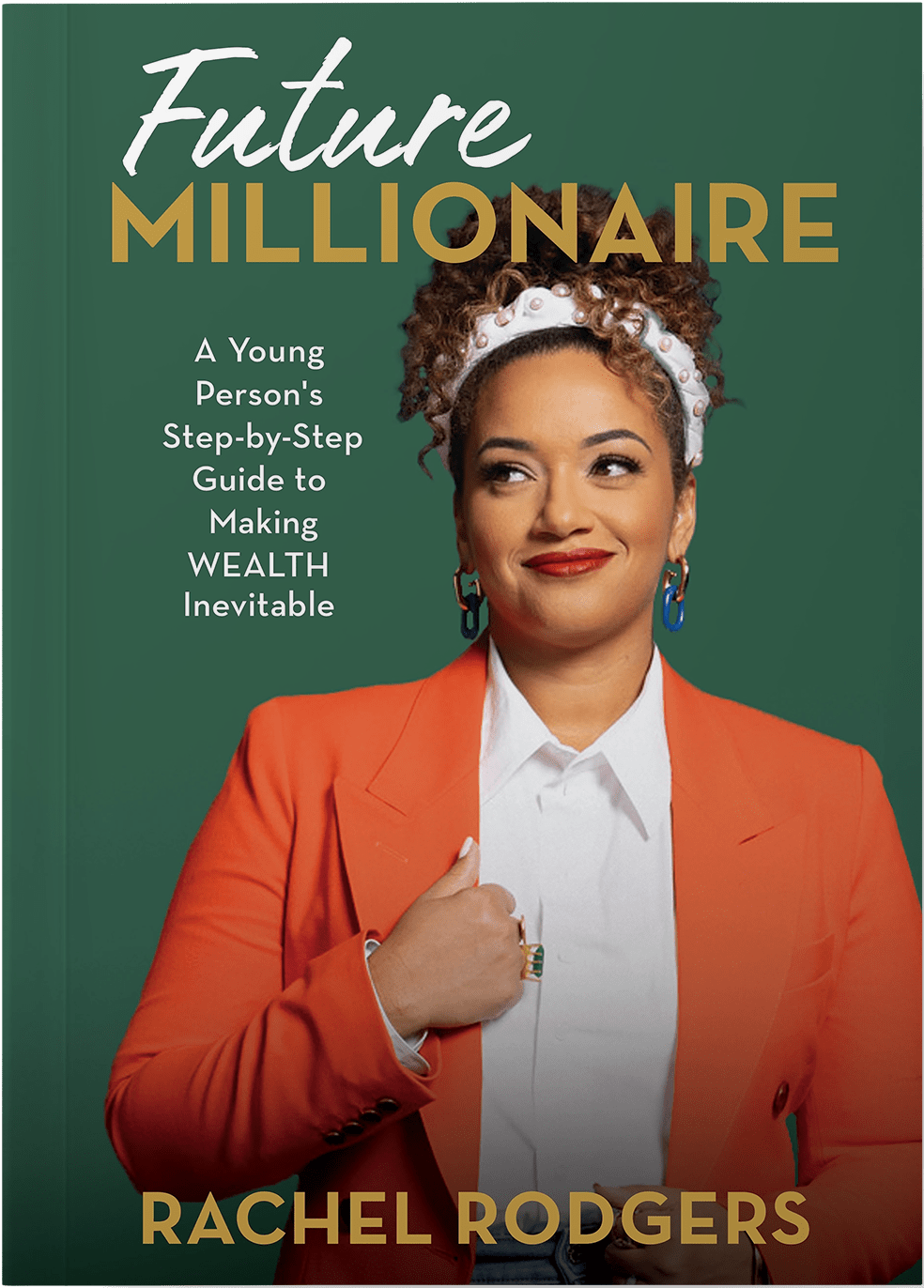
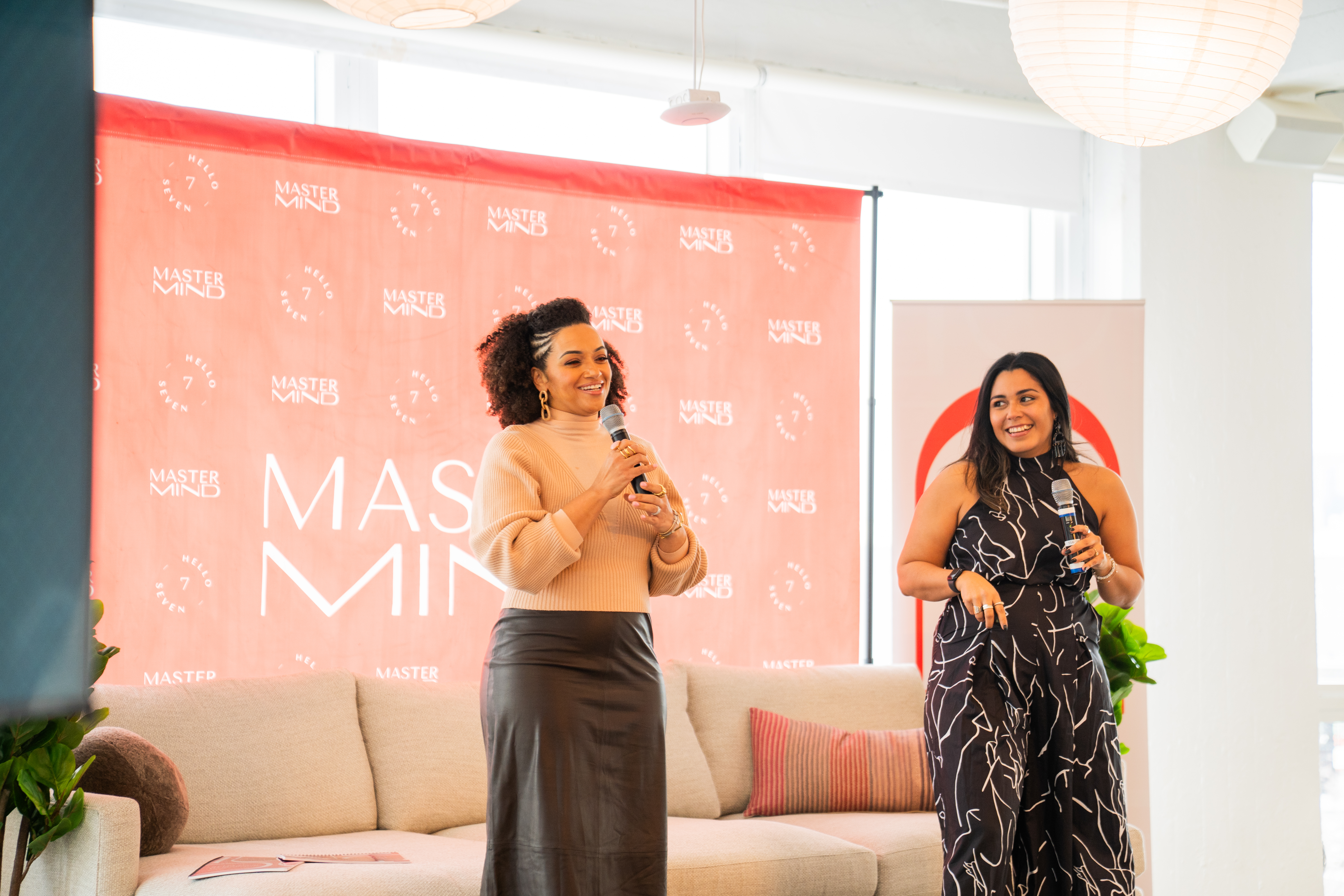
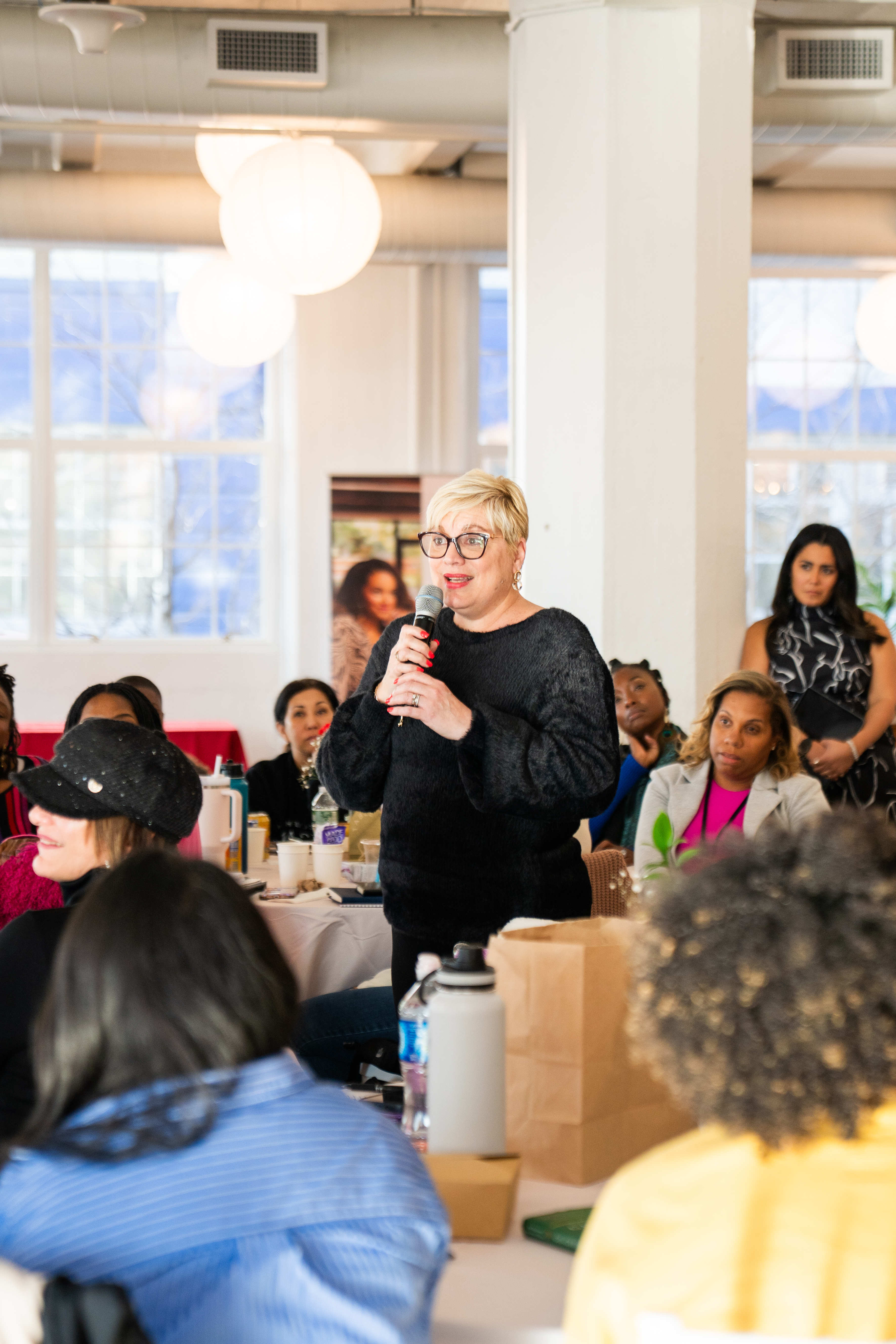
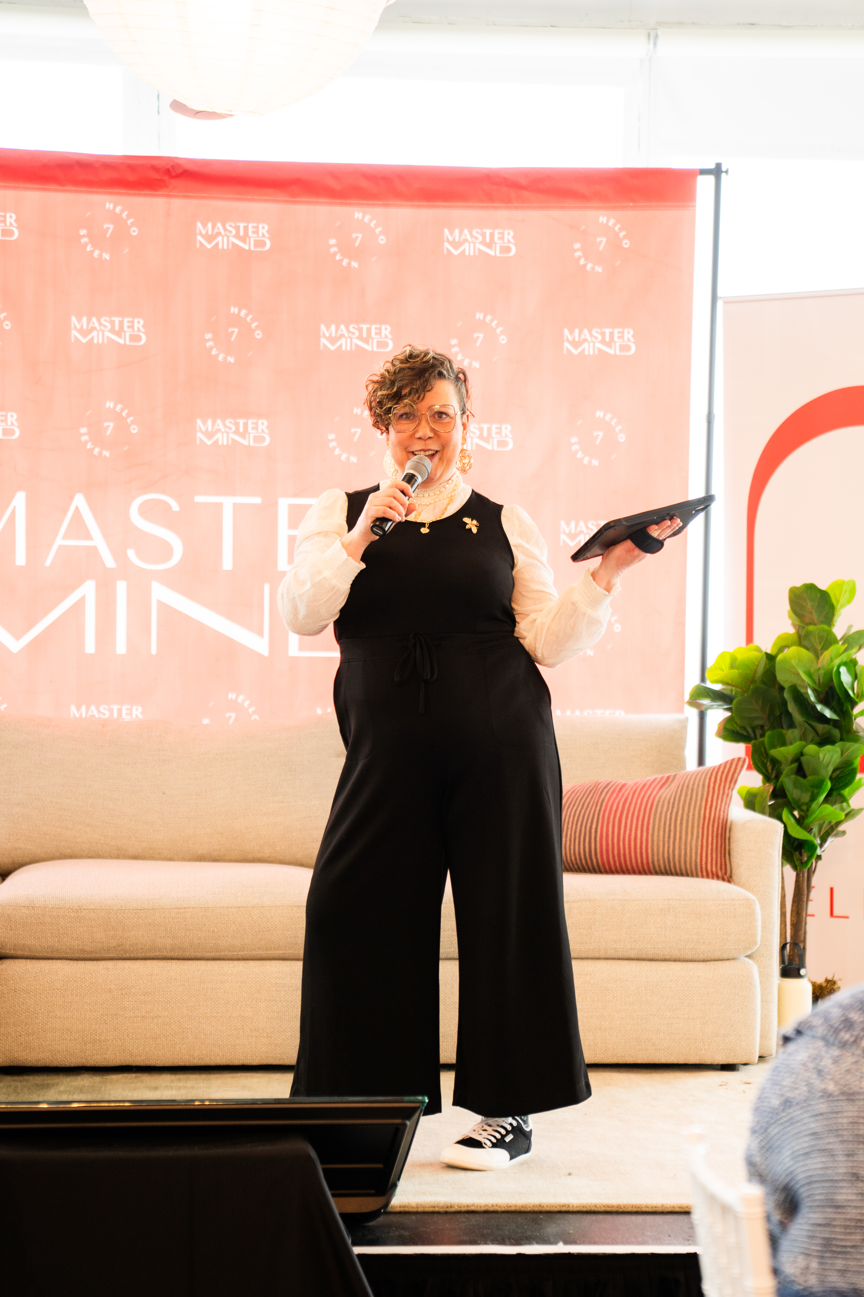
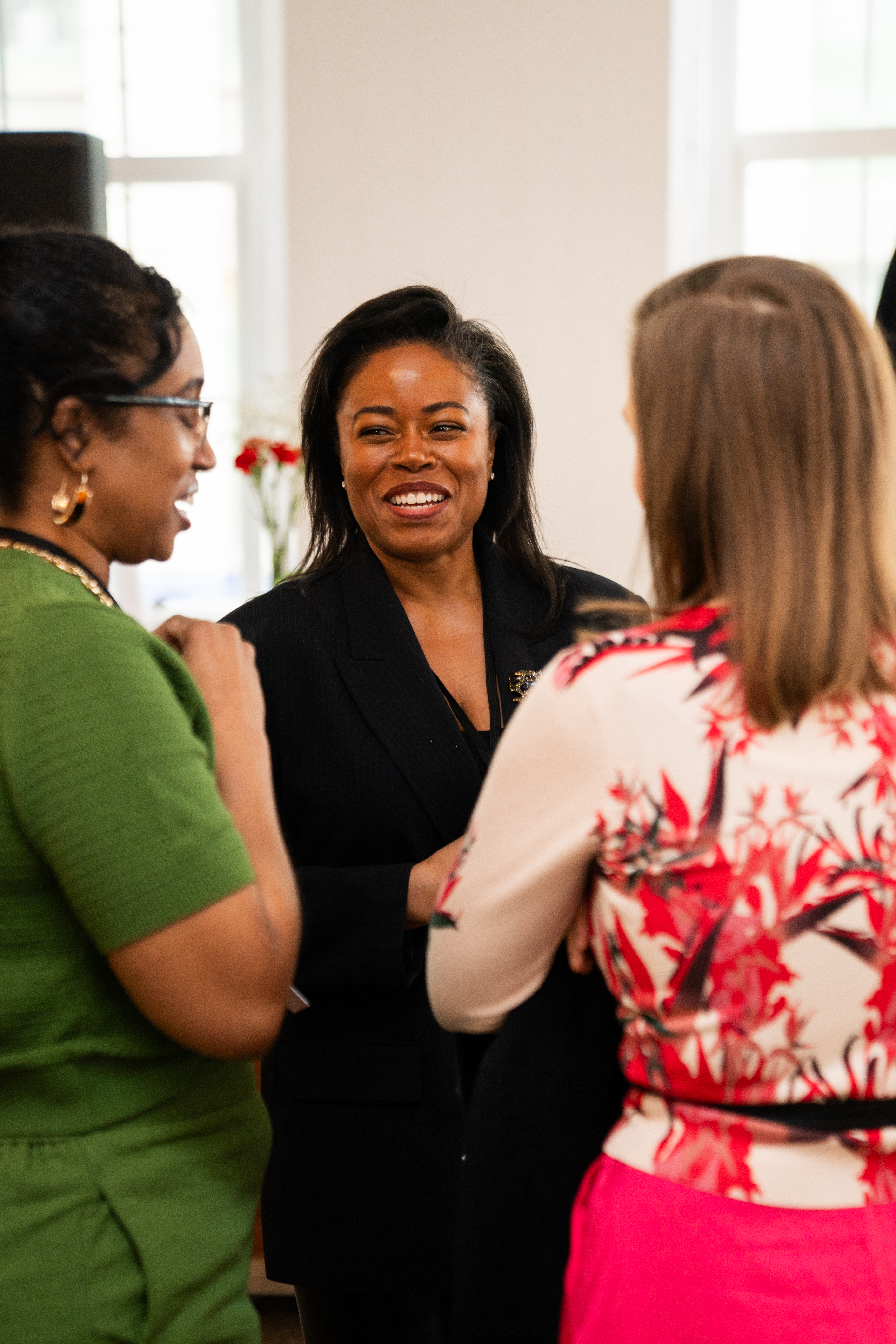
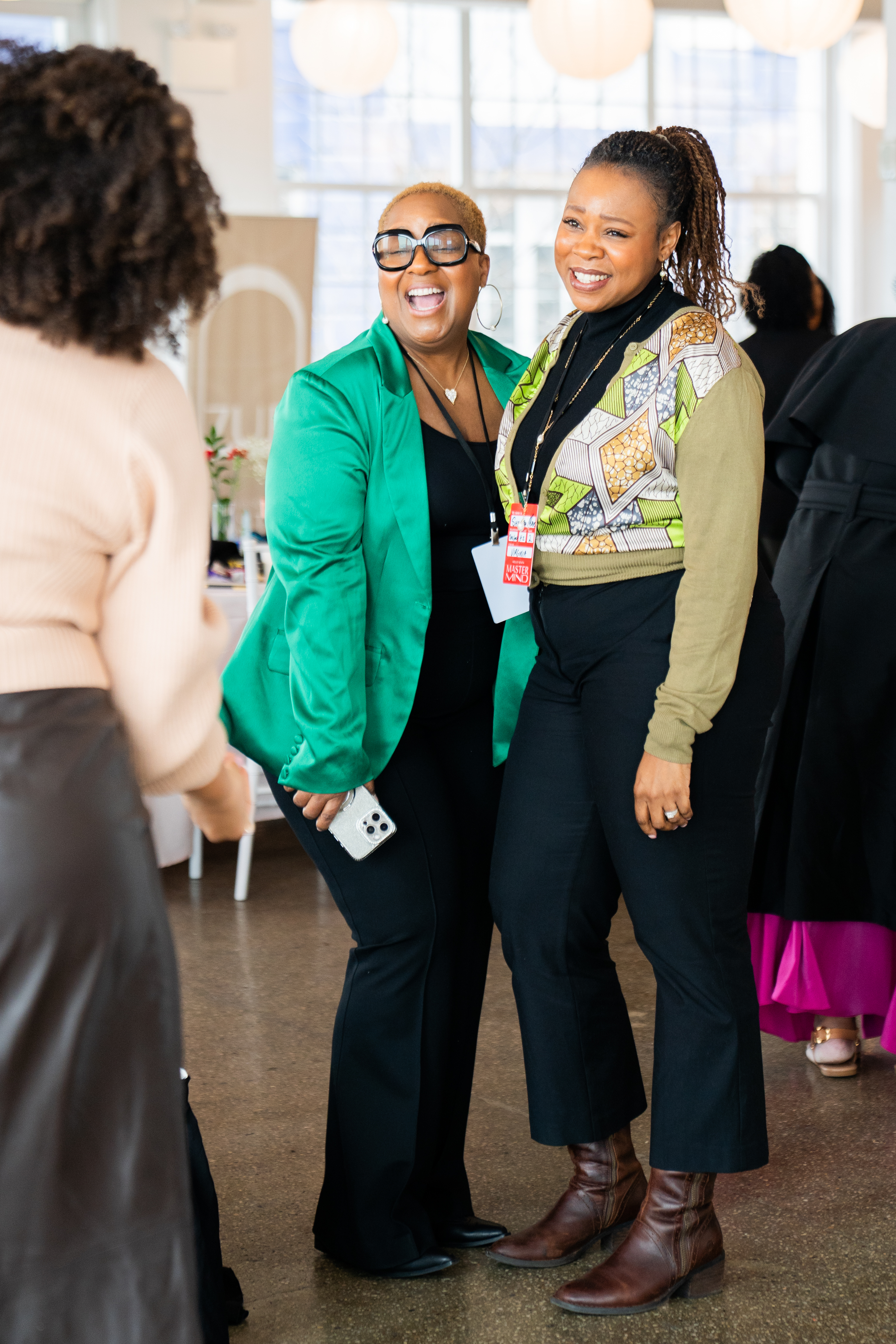
Photography does the human work that color and type can't. Real women laughing, hugging, raising hands — not lifestyle stock. Diversity by design, not by accident. Warm color temperature, never cold.
Photography direction
Approved imagery lives in /https://helloseven.co/wp-content/uploads/h7-brand/assets/images/. Request new shoots through the brand team.

Treatments
Photos stay full-color. The only allowed treatments are a dark gradient for text overlay, a subtle film grain, and selective black-and-white for member portraits.
Approved
- Full-bleed full-color photography.
- 0 → 0.78 black gradient (bottom-up) for text legibility.
- Subtle film grain (
feTurbulence~0.55 opacity, overlay blend) on dark sections. - Black-and-white member portraits — adds journalistic credibility.
- Warm color grading; slight grain acceptable.
Off-limits
- No red duotone, no multiply tints, no color-shift filters.
- No cold blue grading. No desaturated-flat-corporate look.
- No "modern" abstract gradient overlays.
- No stock photography of strangers — always real Hello Seven community.
- No hover effects or animations on primary photography.
Iconography
Hello Seven is icon-light by philosophy. Visual weight lives in type, color, and photography — not a dense icon vocabulary. Use Lucide at stroke-width 1.5 for anything not covered by the brand SVGs.
Sections breathe. Then they punch.
Bright sections layered with rhythm: blush → white → blush, punctuated by a single high-contrast accent — a red marquee, a red CTA, or one black-and-white photo block. Generous whitespace in editorial sections; tight density in hero and CTA blocks.
Spacing scale
Multiples of 8. Most layouts only need --sp-4 through --sp-9.
Containers
Wide for display, narrow for reading. Don't try to make wide and narrow share the same container.
- Display container — 1240px max. For hero type and full-width photography.
- Reading container — 780px max. For long-form copy.
- Measure — 65ch max on any paragraph regardless of container.
- Gutters — clamp(40px, 7vw, 96px) on outside edges of any section.
Corners & borders
Editorial, not app-store-rounded. The brand reads premium when the corners stay tight.
- Buttons — 4px radius. Pills for tags only.
- Cards — 8px radius. Large containers can go to 16px.
- Images — sharp 0px corners by default. Round only if there's a system reason.
- Borders — 1px hairline in
#C7C7C7or 2px solid black. No dashed, no inset shadows. - Shadows — minimal. Rely on color contrast for elevation (blush card on white), not drop shadows.
The marquee
Structural, not decoration. Used to break sections. ~40s loop. Don't pause it on hover.
A small set, used loudly.
We keep the component library deliberately small. A button. A card. A marquee. A list. That's most of it. The system gets its strength from doing a few things at high volume — not from layering on more controls.
Buttons
Solid red primary. Black ghost secondary. On dark photography, switch to the white-outline variant. Hover deepens — never lightens.
- Height52 px (14 + 32 padding)
- Radius4 px
- TypeMontserrat 600, 14 px, +0.06em, UPPERCASE
- Stroke2 px solid, matches background
- HoverBackground → Red Deep #E30613
- PresstranslateY(1px). No shrink.
- On darkWhite outline, transparent fill. Hover inverts to white fill, black text.
- PairingPrimary red + ghost-white. Never primary red on red background.
Cards
Heavy 1px black hairline. No drop shadow. Image on top, eyebrow → title → body inside.
Million-dollar requests, live workshop
Three days of pricing, positioning, and the exact scripts you need to ask for what you're worth.
- Border1 px solid Black, no shadow
- Padding24 px copy block, 0 around image
- EyebrowRed, 10 px, +0.22em UPPERCASE
- TitleTenor Sans, 22–28 px, line-height 1.1
- BodyMontserrat 400, 13 px, charcoal
- HoverNone on photo. Title underlines.
Slash list
Our parallelogram "7" glyph as a bullet — the only ornamentation we use in body copy.
- Use for short scannable lists in marketing copy, syllabi, and program outlines.
- Don't use for nested lists or for long-form content where a paragraph reads better.
- Spacing — 14px between items in standard size, 8px in the
--smvariant. - Glyph — comes from
/https://helloseven.co/wp-content/uploads/h7-brand/assets/icons/bullet-slash.svg. Never substitute a unicode bullet or dash.
Editorial decks. Not corporate ones.
16:9 always. One idea per slide. Big Tenor headlines, generous margins, never more than two columns of copy. If you have to shrink the type to fit, cut the content instead.
Title slide
Black ground. Red eyebrow. Wordmark in the footer. The headline carries the moment.
You can be
a millionaire.
helloseven.co
Section break
Use the red break liberally — every 3–4 content slides — to keep rhythm and energy.
Content slide
Blush ground. Big red numeral or display word anchors the slide. Copy lives on the left in a narrow measure.
Quote slide
White ground. Red opening and closing quotes. Attribution always in eyebrow style underneath.
Deck rules
Most "bad" decks fail on one of these. Hold the line.
Do
- 16:9 only. 1920×1080 working size.
- Mix 1 title · 3–4 content · 1 section break · repeat.
- Use full-bleed photography for transitions and emotion beats.
- Set body copy at 18–24 px equivalent — never smaller.
- One CTA per deck. At the end. Red.
Don't
- No bullet lists with more than 4 items.
- No agenda slides with 8 line items. Cut to 3.
- No "thank you" closing slide — close with the CTA.
- No transitions, swooshes, or animated text builds.
- No corporate footers with phone numbers and copyrights on every slide.
Everything you need lives here.
Logos, fonts, templates, color tokens. If you're working on Hello Seven material and you don't have one of these, ask brand@helloseven.co.
Asset library
Drop-in files. Always reach for the SVG.
Logo pack
SVG, PNG, and EPS versions of the wordmark, badge, and all sub-brand lockups. Light and dark backgrounds.
Browse logo specs →Font files
Tenor Sans (licensed, served from /fonts/). Montserrat via Google Fonts. Mapping notes for Google Slides & Docs included.
View type system →Color tokens
CSS custom properties, Figma styles, and Sketch palettes. Use #FD1729 in code; pull from H7 / Colors in Figma.
Slide templates
Keynote and Google Slides masters with title / content / quote / section templates pre-built.
Slide system →Working with us
When in doubt, send it over. We'd rather review early than rebuild late.
- Approvals — Any external-facing piece using the wordmark needs a 1-line approval from brand@helloseven.co before launch.
- Photography requests — Submit shoot briefs through the brand team. We don't license third-party stock.
- Sub-brand work — Mastermind, Coach, and Podcast each have additional sub-system rules. Ask before you start.
- Co-brand lockups — Partner logos sit to the right of the wordmark, separated by a vertical hairline rule, equal cap-height.
- Edge cases — Email brand@helloseven.co. We move fast.
